TYPEFACE DESIGN–
IROD SANS
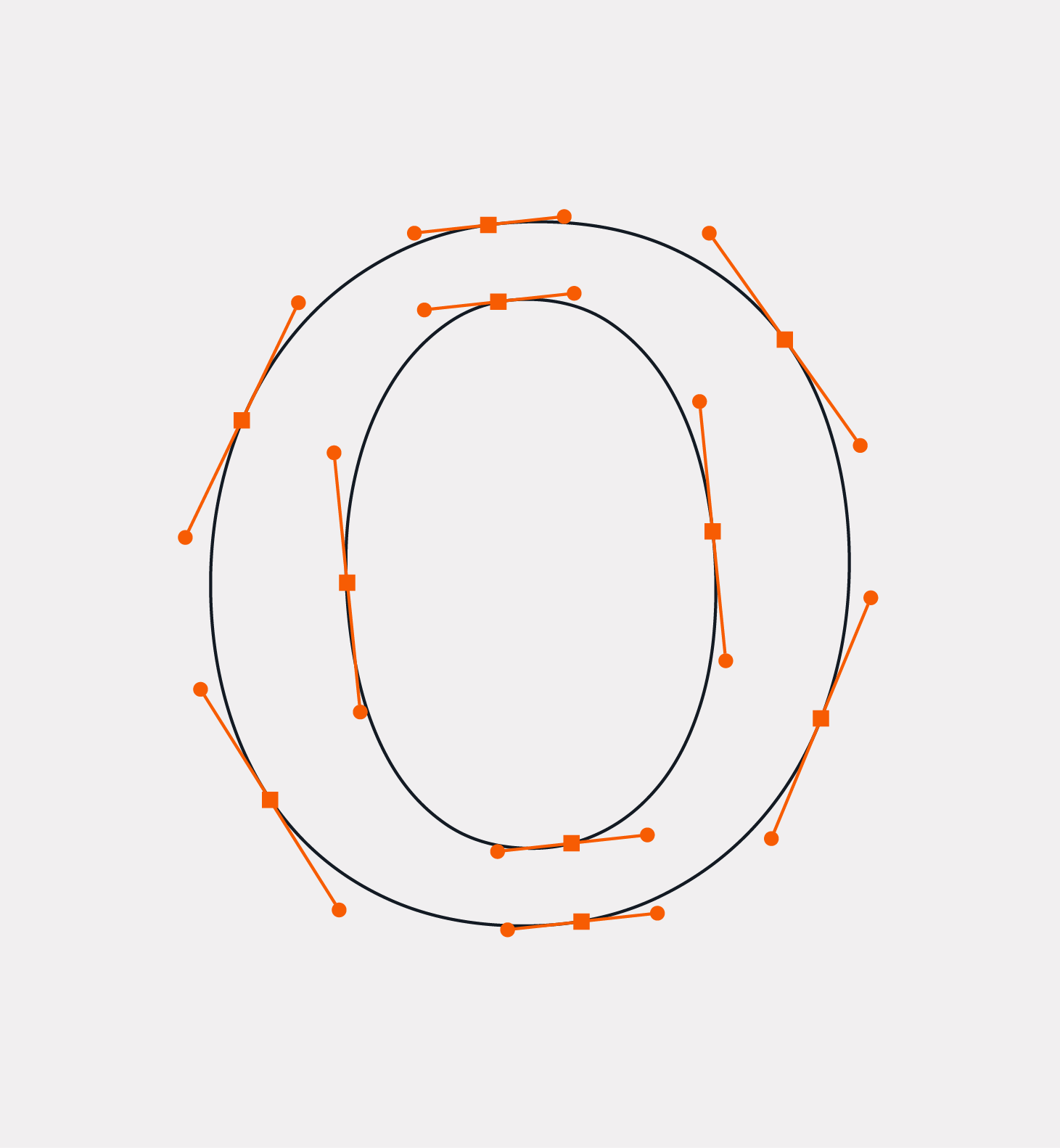
A great amount of sans-serif typefaces hardly have any stroke contrast or none at all. While creating my typeface, Irod Sans, I decided to go against the grain and make the letterforms possess higher contrast. The letterforms that could naturally split vertically were separated, where the remaining ones were left alone. The only time where that rule was broken was for the letter “Q”, imitating the strange nature of the letter. The glyphs were created in Illustrator and then imported into FontLab 7, where it was turned into a functional typeface that can be downloaded on a computer.


