ICON COLLECTION–
LIFESTYLE
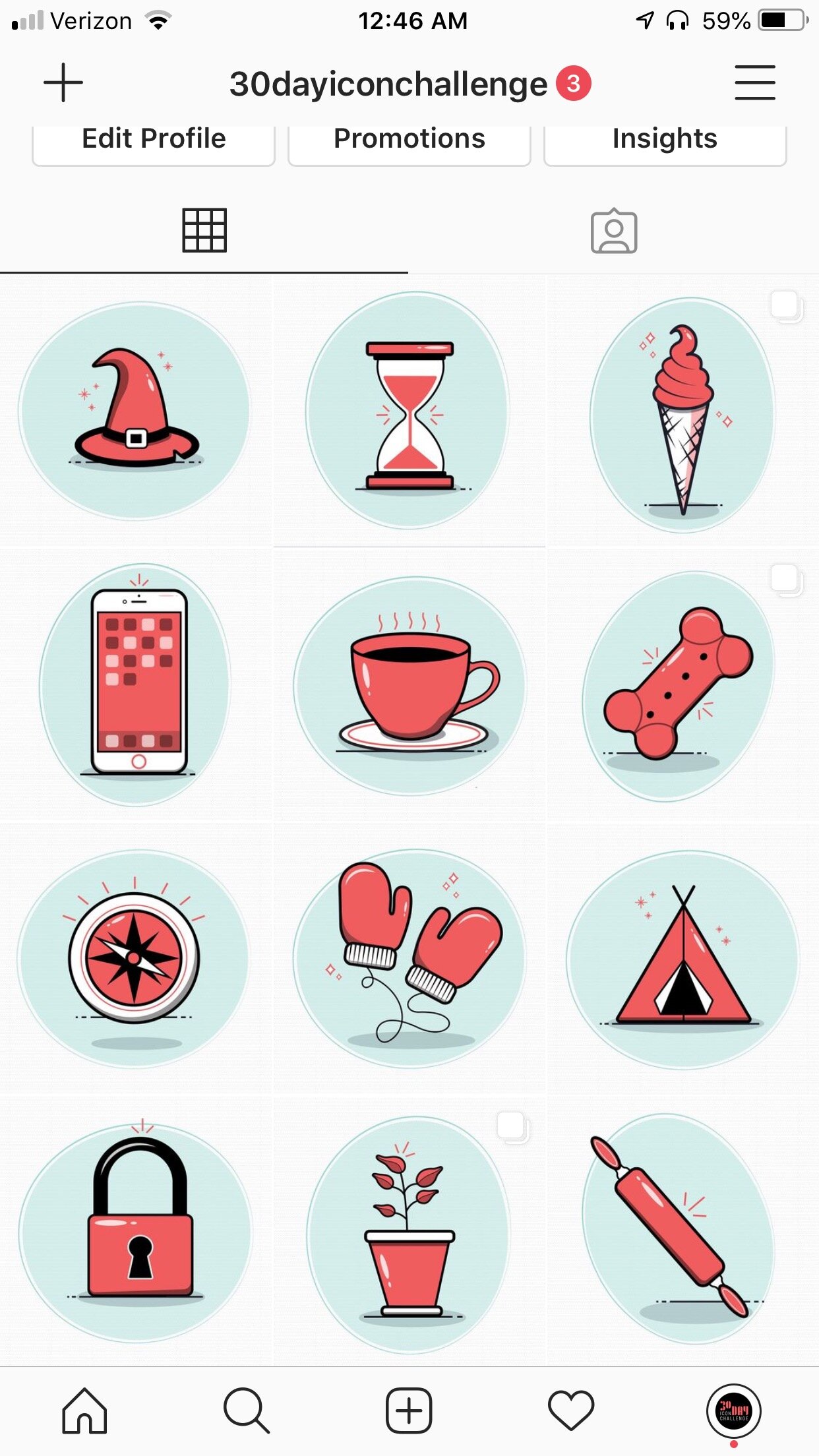
During the month of October I created a new icon everyday that fit in a lifestyle category. I kept elements consistent throughout my process like the color, shadows and highlights. For my main outline stroke I set it at 4 pt. and details were set at 2 pt. The accent marks surrounding each icon varied between sparkles, stars, and movement dashes. Everyday a post was made on Instagram under the handle @30dayiconchallenge. These icons explore a cartoonish yet refined style.

Behind the Scenes
I kept elements consistent throughout the process, like the color palette, shadows, and highlights. My main outline stroke was set at 4 pt., and details at 2 pt. Accent marks (sparkles, stars, and movement dashes) added variety and personality. This system brought my ideas to life, resulting in a cohesive, polished lifestyle icon set.
Define Visual Guidelines: Established stroke weights, colors, and accent styles for consistency.
Sketch Concepts: Created rough ideas to explore shapes and layouts for each icon.
Vectorize in Illustrator: Digitized sketches using the Pen and Shape tools, ensuring precision and scalability.
Refine Details: Tested icons at different sizes, adjusting alignment, stroke consistency, and legibility.
Accent Marks
SWIPE RIGHT
–
DESIGN PROCESS
–
SWIPE RIGHT – DESIGN PROCESS –
Different color options.


